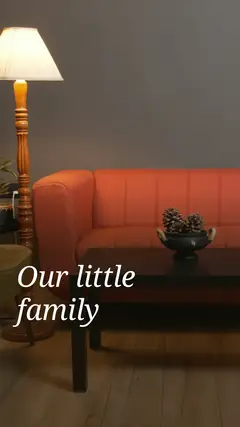
Choosing the best aspect ratio for each platform
The aspect ratio decides how much screen your post takes up and how photos get cropped. Picking it first makes every other design decision easier.
What aspect ratio means
Aspect ratio is the relationship between width and height. A 1:1 page is square, 4:5 is slightly taller than wide, 9:16 is a tall phone screen and 16:9 is a wide video frame. The ratio matters more than the exact pixel size, because platforms scale images to fit the screen.
PostCRSL offers eight ratios: 4:5, 1:1, 9:16, 3:4, 4:3, 16:9, 2:3 and 3:2. All pages in a post share the same ratio, which keeps a carousel consistent when someone swipes.
Common choices by platform
The table below lists widely used, conservative choices. Platforms update their specifications from time to time, so always check the current help page of the platform before you publish.
| Platform / placement | Ratio | Notes |
|---|---|---|
| Instagram feed (portrait) | 4:5 | Takes up more vertical space in the feed; a popular choice for carousels. |
| Instagram feed (square) | 1:1 | A safe, classic option that displays cleanly in grids. |
| Instagram Stories and Reels | 9:16 | Full-screen vertical. Keep key text away from the top and bottom edges where buttons appear. |
| TikTok and other short vertical video | 9:16 | Full-screen vertical, same caution about interface overlays. |
| Pinterest pins | 2:3 | Tall pins are the commonly recommended shape. |
| YouTube and landscape video | 16:9 | The standard widescreen frame for horizontal video. |
| Facebook and LinkedIn feed posts | 1:1 or 4:5 | Square and portrait images generally display well in feeds. |
| Print-style or photo layouts | 3:4, 4:3, 2:3, 3:2 | Close to classic camera and print proportions; handy for portfolios. |
How to pick when you post in several places
- Design for the main destination first. If most people will see the post in a feed, start with 4:5 or 1:1.
- Make a copy for other formats. Duplicate the project and switch the ratio, then adjust crops page by page.
- Keep important things near the center. Text and faces in the middle survive crops and interface overlays best.
It also helps to think about how the post will be seen. A feed shows your first page among many others, so a taller 4:5 page simply has more room to catch the eye. A full-screen 9:16 format fills the whole phone, which suits immersive photos and video but leaves less safe space for text near the edges. Wide 16:9 pages look natural on a laptop or TV but appear small when a phone is held upright.
Changing the ratio in the editor
You can change the aspect ratio at any time in the editor. Photos keep their content but may need re-cropping, and text boxes may need moving. Step through every page afterwards to check nothing important is cut off. If you plan to export as video, see mixing photos and video in one post for how pages turn into an MP4.
Quick answers
What is the safest ratio for a feed carousel?
Square 1:1 and portrait 4:5 are both widely used and display well in most feeds. Check the platform help page for its current guidance.
Can one post use different ratios on different pages?
No. All pages in a post share one ratio so the carousel looks consistent. Duplicate the project if you need another format.